Painting provides an easy transformation to freshen-up tired walls and ceilings and change one’s frame of mind. Color communicates. It can articulate a comforting and inviting atmosphere without words—not only for those who live in the home but also for those visiting your abode.
Various colors actually verbalize what you, as a person, are all about. However, when choosing hues and shades of such, you must be aware there’s a psychological value that can emit specific feelings—from tranquility to turmoil. Wise choices on the color wheel are essential to attaining the mood you want to convey. With small “sampling” sizes now available, it’s beneficial to invest a little extra money and time experimenting with different colors—just to see how they make you feel.

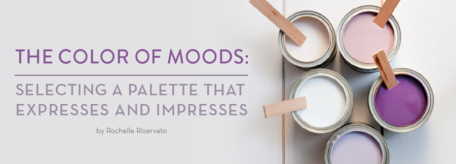
COLOR PSYCHOLOGY 101
PURPLE has dark values rich in sophistication, creativeness, and luxury. However, the lighter shades—such as lavender and lilac—can be compared to the same restful quality as the blues.
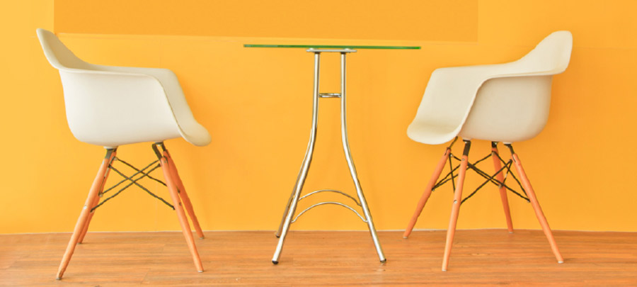
ORANGE is energetic, inducing moods of excitement and enthusiasm. Great for exercise rooms, it can create an emotional reaction needed for vigorous fitness programs. Needless to say, it’s best not to involve this dynamic color into living or sleeping areas.
YELLOW conveys happiness and can cause a room to feel expansive and welcoming. Shades of maize are said to stimulate the nerves and purify the body.
GREEN is deemed to be the most restful color for the eye, relieving tensions and stress and providing a relaxing atmosphere. Perhaps that is why, at this time, the color of the year for 2015, according to Benjamin Moore, is Guilford Green, which has a silvery glow. Says the company’s creative director Ellen O’Neill, the color is “a neutral that’s a natural,”
BLUE has been bestowed with the power of lowering blood pressure and slowing respiration and heart rate; therefore, blue creates a calming, relaxing, and serene color choice if that’s your goal. However, stick to the lighter shades of blue to fashion a calm effect, as darker shades may induce sadness.

RED raises a room’s energy level. It’s the most intense color—an adrenaline-pumper like no other hue. Additionally, it’s magnetic as a people-gatherer, and it kindles dialogue.
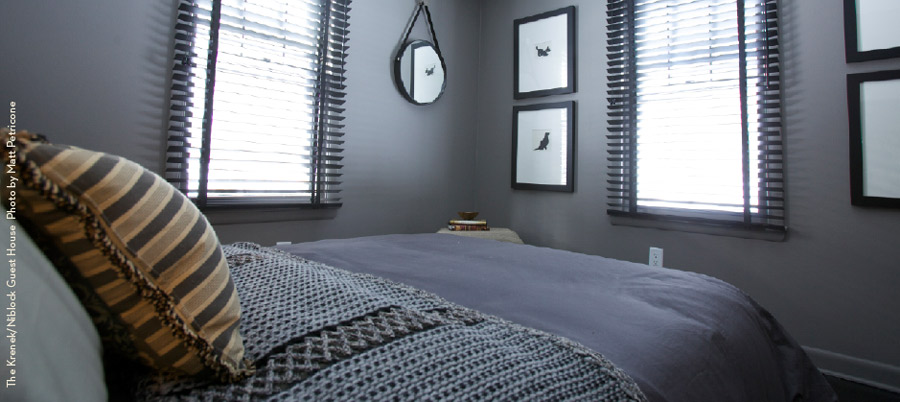
NEUTRALS refer to shades of gray, white, black, or brown. Their flexibility is their propensity, for you can pop colorful accents with these neutrals to add life or keep it simple. You can also combine neutrals to calm things down. Most experts agree that touches of black add a better foundation and depth to any color theme.
The “Fifth” Wall… The Ceiling
Representing one-sixth of a room’s space, a ceiling may be lost in decades of white paint. Mostly overlooked in well thought-out design choices, this “fifth wall” is usually painted in the safest color—white. What a shame, for this can actually cause you to neglect an enormous opportunity in creating the atmosphere you desire. Although committing to ceiling color was popular in Victorian times, it was typically only done on wainscot porch ceilings (not interior ceilings); a pale blue represented the soothing effect of open skies. But times have changed!
If you’re entertaining the idea of painting a color on an interior ceiling, there are several strategies to help color choices. You could match the ceiling to the rest of the room–giving completion and richness to the effect of the atmosphere you desire. Another concept is to tweak the chosen wall color, altering it to be several shades darker or lighter on the ceiling. This retains a tranquil environment with cohesiveness—but adds intensity and the element of dimension. Yet another approach is to paint your ceiling an entirely different color that not only contrasts and complements your walls but also adds personal character and sparks interest.
When making your decision, keep in mind this rule-of-thumb: when ceilings are lighter in color, then the walls feel higher, so don’t rule out white ceilings entirely. Conversely, darker ceilings make the walls feel lower, which can simulate coziness and closeness, even in a huge room.
AUTUMN
FALL is a naturally inspiring, colorful time of year to transform your home environment to reflect your personality and the mood you want to convey. It's is the most favorable time to paint, as temperatures are cooler and to your advantage. Plus, it gives homeowners time to have their homes ready and beautifully redone for the upcoming holidays.
What the Experts Have to Say
Here is some terrific advice from professionals who are painterly proficient. They’ve shared their expertise to help you not only enjoy your endeavor but to also guide you to a result that’ll fit in with your personal choices.
Color Trends: According to Allison Keck, Interior Decorating Consultant for Herzog’s Design Center, “Currently, colors with gray bases are the trend tying everything together. We are recommending gray tints in the kitchen, dining room, and bedroom every day. More and more often our clients are requesting neutral colors yielding soothing effects.”
Color and Clutter: Ann Williams, another one of Herzog’s Interior Decorating consultants, advises to use a “soft color palette to help clutter fade into the surrounds of the room. A monochromatic color scheme uses tints and shades of the same color. It creates a look that is sophisticated and elegant. The effect of a monochromatic color scheme can be subtle and subdued when using a soft color; it also creates a calming effect. If the goal is to achieve a decluttered atmosphere, I would not recommend using an accent wall with a pop of color because it interrupts the flow of the room, making it more disjointed.”
Paint Texture: Allison Keck finds that glossy finishes tend to accentuate wall imperfections that could become distracting to the room. She adds that sheen creates visual excitement that could overpower the room’s decor. She says, “Conversely, a matte finish absorbs light, creating a soothing environment.”
Save the Date:
On Saturday, September 26, FRED, a new home décor and design shop located in High Falls, will be holding an in-store event with color and design consultants from the British paint company, Farrow & Ball. Owners Michael Van Nort and Charles Farruggio are partnering with F&B to offer the FREE consultations with top experts of paint and interior design. Visitors are encouraged to bring photos and fabric samples for personalized advice. A cocktail party will follow in late afternoon/early evening. 1209 Route 213, High Falls. For more information and times, call 845-687-6276.